Monday, December 14, 2015

Activity 3


Compare and contrast a landscape photograph with a landscape painting. Discuss the expressive possibilities of each medium using your examples to illustrate your argument. Choose your examples carefully as representative of the medium.
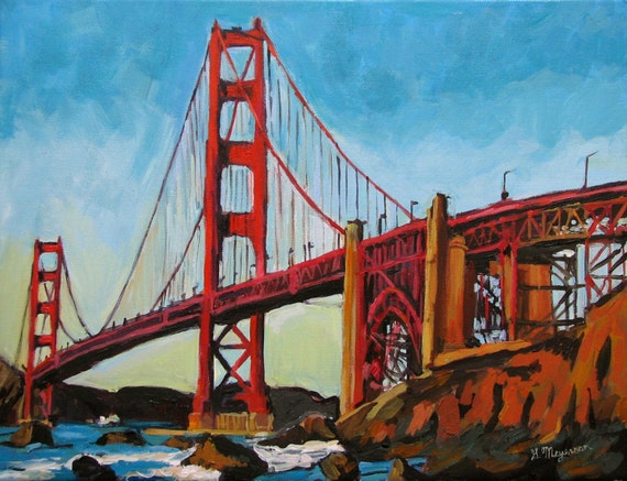


Gwen Meyerson

Doug Marshall


When you look at a painting and a photograph and compare the two, you can definitely see the contrast. A painting will always be more grainy and animated whereas a photograph, will be extremely clear and sometimes even more so then your own eyes. However, both have require various steps in order to capture the moment.


The painting I chose for this example, is one of the Golden Gate Bridge. It is obviously a painting because it looks like something out of a cartoon and most paintings will look like that. The good thing about a painting however, is that the artist can choose whatever colors they want for the moment because it a creation rather than a capture. In a creation, the artist has 100% control over properties such as lighting, contrast, shadows, and more.


In my photographic example of roughly the same image, you can see how the image portrays the Golden Gate Bridge in a crystal clear fashion. It is so clear, that in fact this image was taken at night and you can still see the small details on the bridge. This couldn't have been done with a painting. But the photo is not better than a painting.


The main difference between painting and photographing, is that one is capturing and the other is creating. Capturing requires patience with you and your subject's surroundings, while creation requires patience with yourself. Both require an intense amount of concentration, patience, and skill.

Tuesday, December 1, 2015

Landscape: Activity 2: Blog


Find two landscape photographs that question social values or act as a metaphor for personal issues that the photographer is trying to express. Discuss whether the communication is clear or ambiguous and how this communication is conveyed.


This image is representing how fast your surroundings can change. You would think that the somewhat flat landscape would keep going, but then it stops with an enormous mountain. The communication becomes clear over time. By that, I am saying that you will not get the message at first and instead you will admire the hugeness of the mountain. But admiring the hugeness of the mountain is all apart of the steps to get you to see the whole picture (see what I did there?).

To me the image is saying to not get used to your surroundings because it can suddenly change.


This image is portraying American exploration and discovery. The American flag in the image is symbolizing national pride and the tourists at the viewpoint represent the admiration for such a discovery. The communication is very clear in this image because you instantly feel the sense of American pride from the American flag.

The image speaks to me in the sense that the beauty in our country deserves respect and it ultimately because a symbol for our nation.

Tuesday, November 17, 2015

Landscape Activity #1


View the image by Walker Evans on this page and describe what you can actually see (objective analysis) and what you think the image is about (subjective analysis).

Discuss how effective Walker Evans has been in using a landscape image to communicate a point of view. Can this photograph be considered as Art? Give two reasons to support your answer.

Make sure you include the image in your blog post with credit in the citation. When you analyze the photo, look for deeper meaning beyond the literal description of the Photo.


Bethlehem, Graveyard and Steel Mill - Walker Evans 1935 © Walker Evans Archive, 1994,
The Metropolitan Museum of Art


The big Cross on the left side of the image is the main subject. The background clearly shows factories and an urban area with a cemetery in the foreground. The image could be showing the cycle of an urban life, where you work and ultimately end up dying and ending up in a cemetery near your where you lived. Basically, the image shows that you never leave.

A question could arise as to "is this art?". The answer to that is a simple yes. It communicates a message across to the viewer about life and death. To me, it makes me want to do something with my life instead of just work and die, ultimately never leaving.

Another reason for why this could be art is because of the neatness portrayed in the image. Everything is perfectly vertical, there is rule of thirds, and even a strong foreground and background. This is important when getting the point across because you want the viewer to be more focussed on the overall meaning and less focussed on how the image is not neat enough to fit personal standards.

The overall meaning to me, is that some people work and die in one place and never leave, even after death. It is actually inspiring because it makes me want to do the exact opposite. I want to live an eventful life and not stay in one place forever. We have a big world, and it doesn't make sense to not explore it.


Wednesday, October 28, 2015

Depth of Field


Find two examples of photographs, which make use of maximum depth of field, and two examples, which have very shallow depth of field.
Describe how the photographer’s selective use of aperture affects the subject in each of the photographs you have chosen.


Image by enggul

The photographer in this image obtained this shot by widening the aperture on their camera thus creating a shallow depth of field. They widen the aperture by bringing down the F-stop number to something like f/2 or f/2.8 for example.


Image by Dustin Diaz

This photographer also used a shallow depth of field. He obtained this by widening or turning down the aperture on his camera to a small F-stop.


Image by Antti Lehtinen

The photographer in this example, clearly wanted to have everything in this photo in perfect focus. By having everything in focus all at once, he closed his aperture to a very small opening. By that, I mean that he turned his F-stop up to something like f/22. If he would have only had his aperture on f/4, then you would only be able to see that first hay stack on the right side. Bigger apertures are vital for images with GDF or Great Depth of Field.


Image taken by Ansel Adams

This is another example which was taken by the famous Ansel Adams. He had to manually increase his aperture to something small enough where he could capture the fine detail leading all the way up to the church and back. This photographer would not have been able to create this using a wide aperture or small F-stop number. These types of photos that use GDF or Great Depth of Field can only be obtained by small apertures and large F-stop numbers.


Tuesday, October 27, 2015

Silhouettes


Find two images that have been shot into the light or included the light source. Explain how the photographer may have gone about taking a light meter reading for these photograph.


Darren Rowse

The photographer analyzed the lighting in this setting and came to the conclusions that the sun (the main light source) is extremely bright and is only emitting light onto one side of the ship. If the photographer wanted to capture the side shown, he would have had to use a large flash in order to cast light onto the subject. The photographer most likely used a light meter to judge how bright the light source is and what he should do in order to capture the genera shape of the ship while also taking in the color of the ocean and sky.


Mahd Zaki

The photographer here most likely used a light meter in order to calculate what he would need for a silhouette. Considering that there is light bouncing off of the water, the subject would naturally be emitted by the radiating sun light. In order to truly capture a silhouette n the subject, the photographer used a light meter in order to calculate how much he should tune his camera setting to only capture the brightest lights from the sunset. If you look in the distance on the right, the little island is also in a silhouette form. This proves that the subject and the island both have natural light emitted on them and that the photographer purposely changed his camera settings to capture the above image.


Monday, October 26, 2015

Light Sources


Activity 2


Blog Entry
Find an example of a photograph where the subject has been lit by a single light source and an example where more than one light has been used.
Describe in each the quality and position of the brightest or main light and the effect this has on the subject. In the second example describe the quality and effect the additional light has.


odlesnova@iStockphoto.com


This subject is being lit b only one light source. The light has an effect of only highlighting the front of the subject, while the rest of the image is black due to low light.


This photo was taken in an outdoor setting. Because of that, they had the sun as the main light source. They also used an artificial light as an additional light to brighten up their faces and erase the shadows on the right side of the image.


Both images have great quality to their lighting and really show the type of lighting style they were trying to achieve.


Thursday, October 15, 2015

Hard Light


- Jim Harmer


This photo by Jim Harmer uses a tool called 'hard light' which focuses larger amounts of light on specific areas while leaving other areas less exposed and darker.

This particular photo has:


a soft texture because the light gives off the feeling of relaxation and that creates an easy image to look at.
The light creates a vast amount of detail when looking at the faces and hair, while the other less-exposed parts contain not as much detail.
The overall mood of the photo is romantic and peaceful. The lighting only highlights the faces of the couple which clearly shows that they are focused on one-another. Using hard light is a good way to highlight certain parts and truly show what you want, while leaving the rest of the image simply for 'background' usage and to complement on the beauty.

Thursday, August 27, 2015

Activity 4

Darren Rowse

The photographer had a sense of imbalance when looking at this but quickly realized that he could balance it out by including the green door on the right or the red door on the left. It creates a sense of safety in the human mind that everything is where it should be.


This images has a major sense of imbalance where you think there should be another eye on the right side of the image. This does not pleasure the human mind and creates a sense that something is wrong. This type of photography is truly special because of the impact that it has to our brains.


This image was taken by Jansen King. It shows that the image is off balance because the whole subject and it's reflection is on one side of the image.


This image was taken by Jansen King. This is not balanced because the dramatically brighter color is at the way bottom of the image where a good 80% is the almost opposite color.


This image was taken by Jansen King. This is again, an imbalanced photo. The flower is the bright subject while the cactus arm is just there for background and structural purposes. The subject is in the bottom left corner of the image which makes the rest of the image unbalanced.


This image was taken by Jansen King. This is yet again, an unbalanced image. The sun setting over South Mountain in Phoenix, Arizona. The subject is the very bright sun in the left of the image while the other side, doesn't have anything to counter-act the sun. Therefore, it is an unbalanced image.


Activity #1

http://photoinf.com/General/KODAK/guidelines_for_better_photographic_composition_simplicity.html

The photographer here, noticed how the cars were a big distraction. They almost take away completely from the subject. The image on the right has the cars cropped out however. This creates a much better image and it clearly shows the subject with minimal distraction.

http://photoinf.com/General/KODAK/guidelines_for_better_photographic_composition_simplicity.html

This image shows a somewhat distracting pay-phone and wall. It can be seen that the cactus on the left of the image is the subject. In the second image, the photographer takes a picture of the cactus by itself with a very basic, non-distracting  background.

Thursday, August 13, 2015

Rule of Thirds Activity 3


This photo shows a perfect example of 'Rule of Thirds'. The pillars in the top left corner make a sort of square that add up to be cross hairs. In the center of the cross hairs would be where the grid would be if you enabled it on this photo.


This photo has the subject (the flower) in the bottom right corner of the image sitting directly on top 
of the imaginary cross hairs of the 'Rule of Thirds' grid that can be places on top of the image. With the 
flower the main subject, and sitting in the location it's in the image, this makes for yet another perfect 
example of 'Rule of Thirds' imagery.


Wednesday, August 12, 2015


This was taken in the Superstitions near Phoenix, Arizona. A few birds taking a break on a floating barrel. It made for a great photo opportunity where I could capture a wide range of colors and contrasts. Something I like to look at to give me good thoughts and to inspire me for more artistic activities.

John Szarkowski (activity 2)

‘To quote out of context is the essence of the photographer’s craft. His central problem is a simple one: what shall he include, what shall he reject? The line of decision between in and out is the picture’s edge. While the draughtsman starts with the middle of the sheet, the photographer starts with the frame. The photograph’s edge defines content. It isolates unexpected juxtapositions. By surrounding two facts, it creates a relationship. The edge of the photograph dissects familiar forms, and shows their unfamiliar fragment. It creates the shapes that surround objects. The photographer edits the meanings and the patterns of the world through an imaginary frame. This frame is the beginning of his picture’s geometry. It is to the photograph as the cushion is to the billiard table.’
-John Szarkowski

John mentions in the above section that photographers are only quoting 'out of context'. By this, he means that the photograph does not capture the entire story, but only captures wha is happening at the exact moment. This is why a lot of false propaganda can be persuasive because it only shows a very small part of the story and typically, not the true story. This 'out of context' can go be either good or bad. After all, it's not the whole story.


Impressionist artists such as Degas were heavily influenced by the things they saw around them. At the time that photography started to take place which was in 1834, the public was shocked by what they saw. For the first time, they could see in-detail pictures that captured a moment instead of having the subjects pause while the artists sketch out what they look like. This was revolutionary and spired artists of all kinds to capture moments t=so people could really see the beauty in humanity. 

Tuesday, August 11, 2015

This is a picture from the Tongass Rainforest near Sitka, Alaska. An amazing forest with life everywhere you can think of. This is a picture of the enormous tress that grow there.